


The Top 5 Crypto Sites of 2017

Запись опубликовал HOQU
2 024 просмотра
The Top 5 Crypto Sites of 2017
With only a little over a month left of of 2017, it is time to start putting the year into review. For us in the crypto community, 2017 has been an exciting year. We’ve seen all types of new decentralized technologies being released all over the world. Investment has been huge, and we’ve seen hundreds of millions of dollars being raised during ICOs and token sales.
We have noticed, too, that the most successful crypto projects this year have had highly effective internet marketing campaigns. We have seen some beautiful websites and some really well-written informative materials coming out of this year’s most successful projects.
This article is a review of the Top 5 ICO sites of 2017. We have chosen these websites based on the UI, their white paper, and their ICO success (amount of funds raised)
Our #1 website is not who you would expect, so read on!
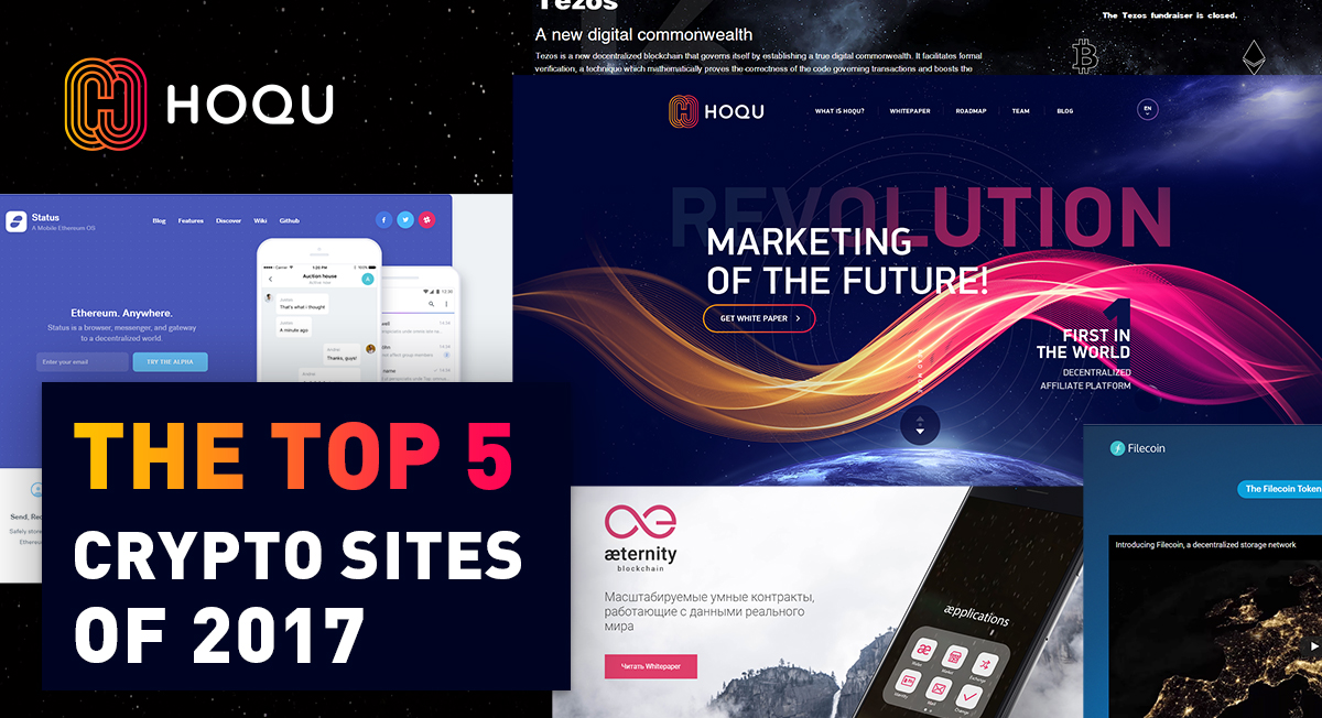
5. Filecoin
Filecoin introduces a decentralized, blockchain-based model for file sharing. Its website greets visitors with a five-and-a-half-minute video explaining the startup’s intentions and its system, which could have been condensed to reduce the time demanded of the viewer.
The rest of the site, is pretty good, but it’s mostly on the plain side. The user can simply scroll to view additional information and the white paper. The only buttons link to external domains.
The white paper is well laid-out and reflects a high level of English, but some parts are highly technical and difficult to understand for the average reader.
4. Æternity
Æternity calls itself “the answer to current challenges in blockchain technology.” Its website is easy to navigate and contains large amounts of succinct information, although the external blog that the FAQ button links to is more informative.
The website’s scrolling design is mostly simple and sticks to a common color scheme, but it is underlaid with ever-changing video clips that range from cool to annoying to distracting, generally hurting readability.
The white paper is anything but white, written like a textbook desperately trying to save paper. However, the language is comprehensible.
3. Tezos
Tezos claims to “govern itself” by “establishing a true digital commonwealth.” Its website, however, is less than impressive; the visitor is greeted with a white paragraph of information against a backdrop that makes it difficult on the eyes.
And that’s about it. The navigation menu is unconventionally at the bottom, easy to overlook. Its buttons call up pages with information, albeit not that much.
Tezo’s white paper, which is not placed out in the open and can be found after a little digging through the site, is nothing remarkable. It’s reasonably clear and reasonably well laid-out.
2. Status
Status serves as a messenger and browser for decentralized applications on the Ethereum network. Its website is simple but well designed. However, aside from a general overview, it provides little information on the startup itself, instead showcasing third-party apps that can be used with Status.
Buttons at the top link to Status’s blog and its Wiki. The Wiki is packed with information, and it is also the only place to find the company’s white paper.
The white paper is well laid-out, complete with stylistic pictures. It is well written and invites even non-technical people to read it.
And then we have our #1 site of the year — HOQU.io. HOQU endeavors to revolutionize affiliate marketing by launching the world’s first decentralized affiliate marketing platform. Visitors to hoqu.io are greeted with a futuristic and aesthetically pleasing design. The landing page is intriguing and invites the viewer to read more — which he or she can be scrolling.
The website contains a single page for the user to scroll down, but anchors can be found at the top of the landing page, making navigation incredibly simple. As the viewer scrolls down and hits individual sections, most play short, simple animations — small gestures that really polish off the presentation.
Unfortunately, the white paper is not yet available, but the website provides sufficient information in its absence, giving the reader a good overview of the platform in succinct doses. Comparisons between the HOQU platform and conventional affiliate marketing platforms paint an even clearer picture.
The site ends with HOQU’s blog, media coverage, and a myriad of ways to contact the team.
The HOQU token sale launches soon. You can find out more, and check out their fantastic website, at https://hoqu.io


1 Комментарий
Рекомендуемые комментарии
Для публикации сообщений создайте учётную запись или авторизуйтесь
Вы должны быть пользователем, чтобы оставить комментарий
Создать учетную запись
Зарегистрируйте новую учётную запись в нашем сообществе. Это очень просто!
Регистрация нового пользователяВойти
Уже есть аккаунт? Войти в систему.
Войти